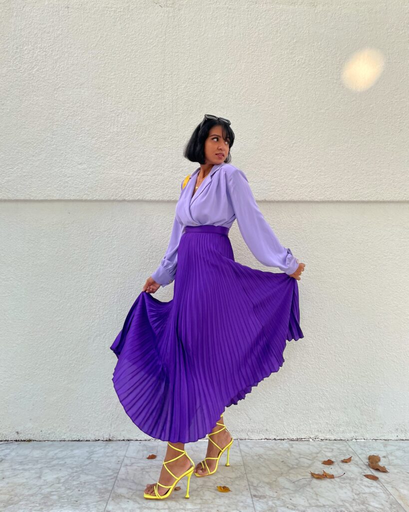
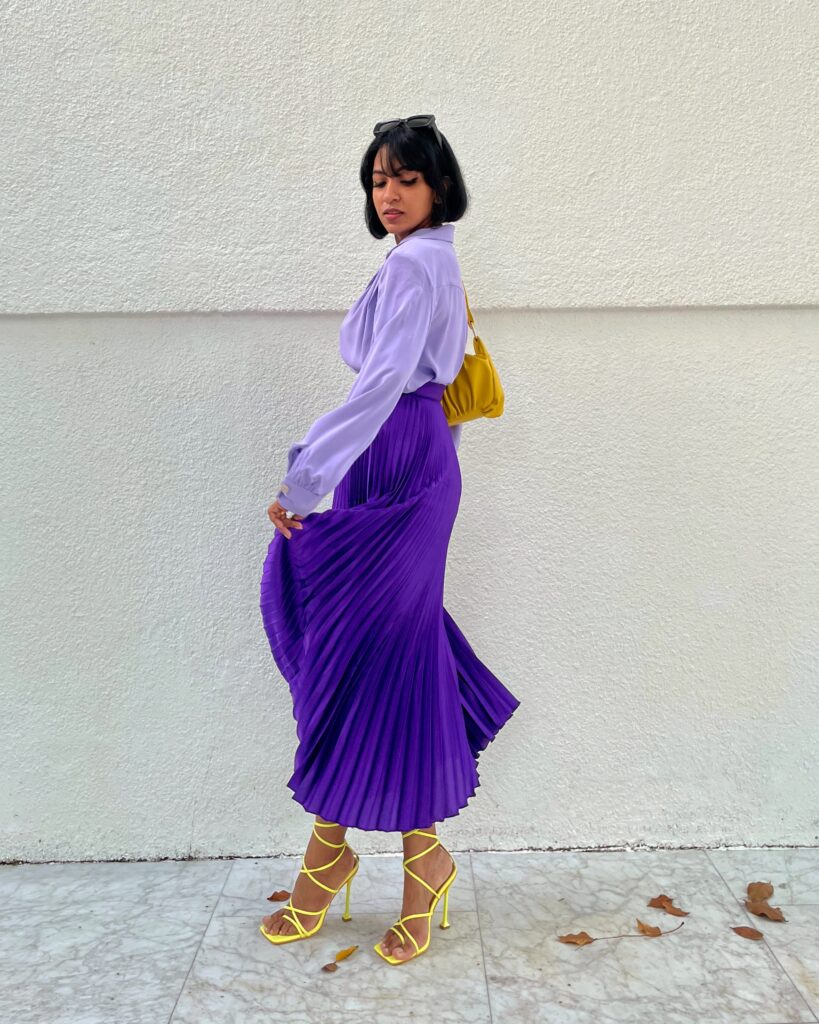
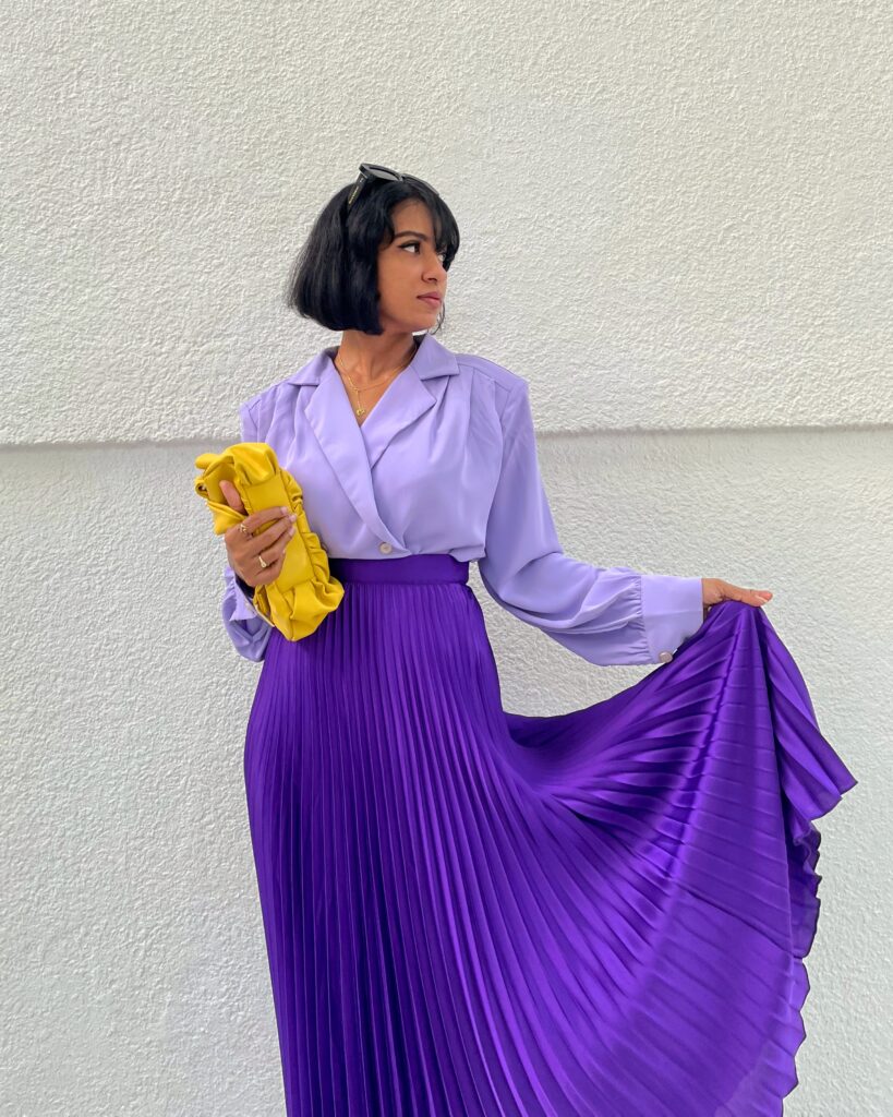
Of course. I had to do it. Color holds a special place in my heart and my wardrobe. For the past three or so years I have been exploring color and how it can be incorporated as wearable (and sometimes not so wearable) pieces; all in the joy of celebrating fashion and personal style.
“A new Pantone color whose courageous presence encourages personal inventiveness and creativity” – as quoted from their introduction on Pantone’s website.
This is exactly my objective for every year. I want to keep evolving and reinventing myself for the better. In every aspect. It does not have to be only in my creative expressions of art and fashion but in my daily life, with relationships as well. So I am here embracing the color and simply enjoying wearing it. Pantone had given four color palettes featuring Very Peri. With suggestions in color combinations. It is helpful to anyone who is looking to pair the color.
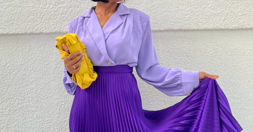
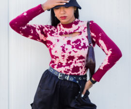
For this outfit I was inspired by their ‘wellspring’ palette. Which had ‘celery’ and ‘dewberry’. I chose a shade close to celery for my accessories. The color was used as a complementary one to break the monochrome look of the outfit.
All photos belong to www.famushu.com and no image or part of it must be used or copied without the prior written permission from the author.

